Responder Developer Guide
Add to Responder User Interface

Resource Center Home

 You may add a custom dockable control to your Responder application using a custom layout XML file. There are two ways to add a dockable control to your user interface. Refer to the Distribute Responder Customization section for more information on creating your custom layout XML.

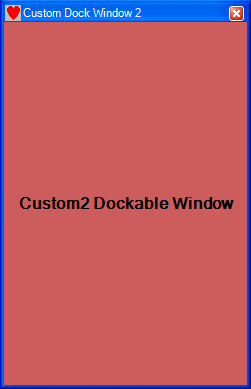
This first method for adding a dockable control, adds it as a separate floating window. The following XML is required to add a custom dockable control to the user interface. Each custom dockable window requires a <Pane> tag.

XML Snippet
Copy Code
<DockManager activeDockControl="DockedWindow13">
 <DockAreas>
  <DockArea width="336" height="352" childPaneStyle="TabGroup" selectedTab="1" 
    dockedLocation="DockedLeft" isVisible="true" floatingLocationX="182" 
    floatingLocationY="421">
   <Panes>
    <Pane xsi:type="DockControlPaneLayout" key="DevDockableWindow"  
        width="248" height="575" isVisible="true" isPinned="true" 
        flyoutSizeX="-1" flyoutSizeY="-1">
     <DockedControl type="Miner.DeveloperSamples.Engine.DevDockableWindow, 
        ArcFMViewerEngineDockWindow" />
    </Pane>       
   </Panes>
  </DockArea>
 </DockAreas>
</DockManager>

The <DockManager> tag (line 1) contains all dockable windows. If this tag doesn't exist, it must be created. It contains the following attribute:

  • activeDockControl: This value indicates which dockable window is activated when the application is opened. This attribute contains the Key for a dockable window.

Dockable windows may be divided into areas. While you may employ the <DockAreas> and <DockArea> tags (lines 2 and 3) to separate the dockable windows, it is much easier to leave them in one area in the XML and then view the dockable window panes in ArcFM Viewer and drag them into groups.

The <Panes> tag (line 4) contains the dockable windows.

Each dockable window requires its own <Pane> tag. The highlighted portion of the sample XML above illustrates the XML required to add a custom dockable window. This tag contains the following attributes:

  • xsi:type: Do not modify this attribute value. Enter it as shown in the example.
  • key: The unique name that is associated with a dockable window. This value must match the Key value set in the dockable window's custom code.
  • type: This attribute contains the qualified path to the class followed by the assembly name. These two values are separated by a comma.
  • width: Indicates the width of the dockable window.
  • height: Indicates the height of the dockable window.
  • isVisible: A true/false value that indicates whether the dockable window is visible. True=visible (default); False=invisible.
  • isPinned: A true/valse value that indicates whether the dockable window is pinned to the user interface. True=pinned (default); False=unpinned.
  • flyoutSizeX: Numerical value indicates the flyout width of a docked window when it is docked on the right or left.
  • flyoutSizeY: Numerical value indicates the flyout height of a docked window when it is docked on the top or bottom.

Method 1 - placed in separate dockable window

Each dockable window also requires its own <DockedControl> tag (included in the highlighted portion above). This tag contains the following attribute:

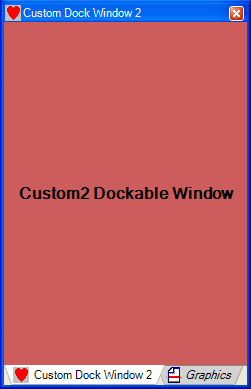
The second method for adding a custom dockable control, adds the control to an existing set of controls. The <DockInsert> tag contains <InsertDockControl> tags for each dockable control you wish to include in a specific dockable window.

XML Snippet
Copy Code
 <DockInsert>
  <InsertDockControl locateBy="GraphicsTab" key="CustomDockCtl2" 
    type="CustomerEnhancements.CustomDockControl2, CustomerEnhancements, Version=1.0.1950.26420, 
    Culture=neutral, PublicKeyToken=null" />
 </DockInsert>

Each <InsertDockControl> tag indicates a dockable control. The highlighted portion of the sample XML above illustrates the XML required to add a custom dockable window. This tag contains the following attributes:

  • locateBy: This indicates the dockable control next to which you want your custom control to appear. In the example above, the custom dockable control will appear near the Graphics Tab.
  • insertBefore: Indicates whether to insert the dockable control before or after the control referenced in the locateBy field. True=insert before; False=insert after (default)
  • key: The unique name that is associated with a dockable window. This value must match the Key value set in the dockable window's custom code.
  • Version: The strongly named assembly information. This information is not required for customization.
  • Culture: The strongly named assembly information. This information is not required for customization.
  • PublicKeyToken: The strongly named assembly information. This information is not required for customization.
  • width: Indicates the width of the dockable window.
  • height: Indicates the height of the dockable window.
  • isVisible: A true/false value that indicates whether the dockable window is visible. True=visible (default); False=invisible.
  • isPinned: A true/valse value that indicates whether the dockable window is pinned to the user interface. True=pinned (default); False=unpinned.
  • flyoutSizeX: Numerical value indicates the flyout width of a docked window when it is docked on the right or left.
  • flyoutSizeY: Numerical value indicates the flyout height of a docked window when it is docked on the top or bottom.

Method 2 - placed near Graphics tab


Send Comment to ArcFMdocumentation@schneider-electric.com